
McLaren has changed its visual identity, and the reaction has been immediate. Unveiled on September 22, 2026, the new system brings McLaren Automotive and McLaren Racing under one more unified expression. It introduces a heritage-inspired wordmark, keeps the familiar Speedmark, expands the colour palette and gives the historic Speedy Kiwi a renewed role.
Am I completely sold on every element? Not quite. The new wordmark feels more nostalgic and less aggressively futuristic than the identity many people associate with modern McLaren. But that tension is precisely what makes this launch interesting. It has captured attention, divided opinion and put the McLaren name at the centre of the design conversation within hours. For a global performance brand, that level of cultural impact is difficult to dismiss.
McLaren’s New Identity Looks Back to Move Forward
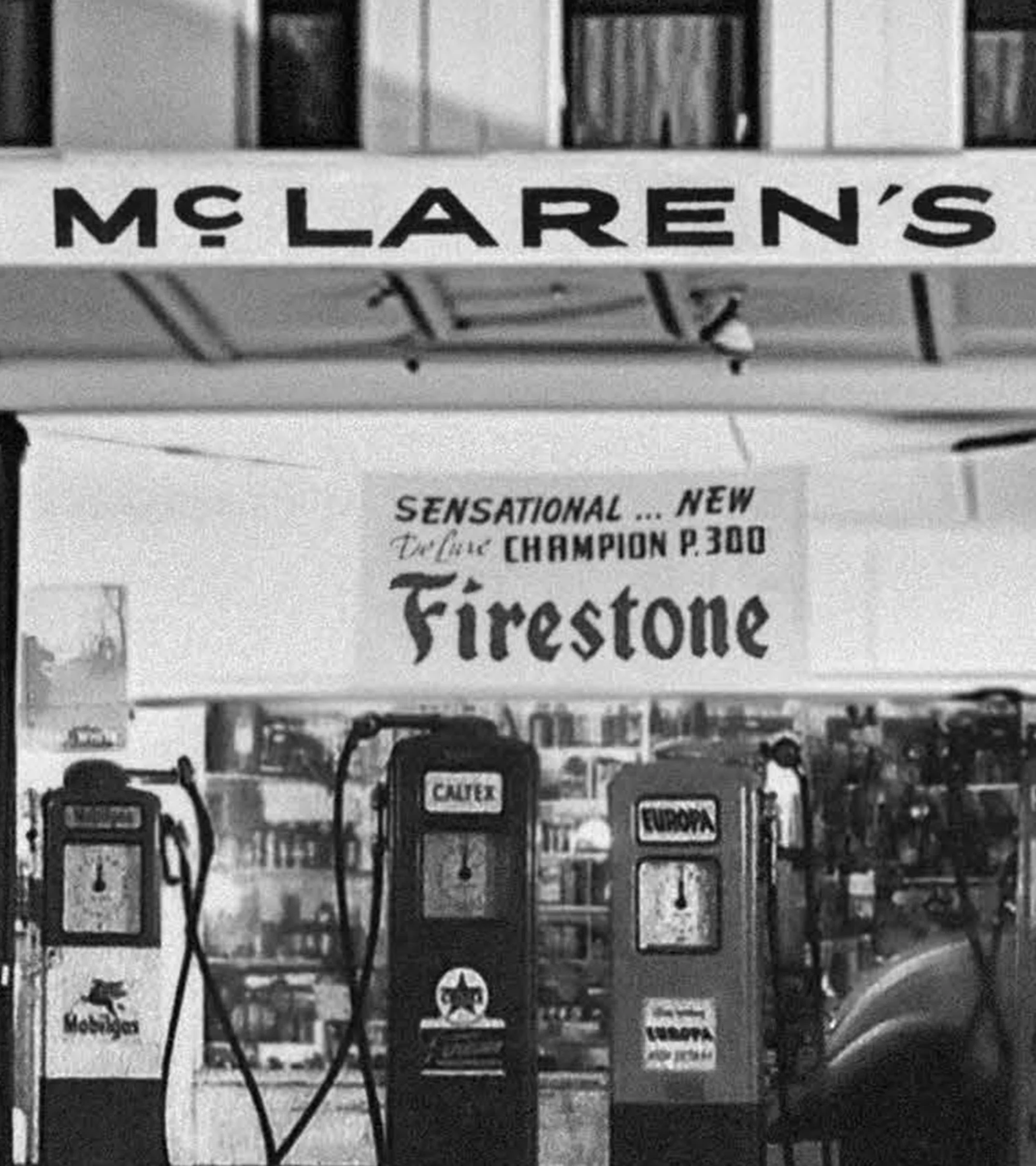
The most significant change is the wordmark. McLaren says its shape was inspired by the sign above the service station owned by Bruce McLaren’s parents, Les and Ruth, in Remuera, Auckland. That location carries real significance: it was where Bruce worked on the car that took him to his first racing victory.
Rather than inventing a completely unfamiliar symbol, McLaren has reached into its own history. The strategy is less about erasing the recent past and more about giving the brand a deeper origin story. Automotive marques often speak about heritage, but McLaren’s history is unusual because its mythology begins with one ambitious New Zealander, a small family workshop and a conviction that the established order could be challenged.
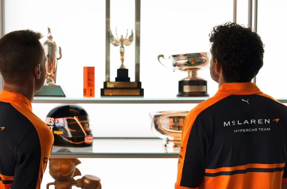
The Speedmark remains, which is an important act of restraint. It is arguably McLaren’s most internationally recognizable graphic device, appearing across road cars, racing operations, apparel and digital media. Papaya also remains central, while a broader palette draws from defining eras in the company’s history. The Speedy Kiwi—the symbol tied most directly to Bruce McLaren’s homeland—has also been preserved.
Why the Design Is Already Dividing Opinion
The outgoing McLaren identity communicated speed with almost clinical efficiency. It was sharp, technical and instantly at home on a carbon-fibre supercar. The new direction introduces more warmth and history, but it also risks losing some of that hard-edged modernity. That is where the debate begins.
Personally, I am not the biggest fan of every part of the new visual package. The typography asks for an adjustment, especially when it appears beside the ultra-modern machines McLaren produces today. Yet branding should not be judged only by whether it looks immediately comfortable. It should be judged by whether it creates recognition, meaning and conversation.

On that measure, the launch is already working. Designers, racing fans and car enthusiasts are comparing eras, debating the typography and tracing the references back to Bruce McLaren. A safe refinement might have earned polite approval and disappeared. This one has become news.
There is also a larger strategic reason for the change. McLaren is no longer speaking to only one audience. Its world now spans Formula 1, IndyCar, an upcoming World Endurance Championship Hypercar programme, road cars, fashion collaborations, collectibles, owner experiences and a growing lifestyle community. The identity has to function on a race suit, a steering wheel, a digital interface, a paddock wall and a luxury invitation without losing its core character.
One McLaren Across Formula 1, IndyCar and WEC
The rollout is deliberately broader than a road-car badge update. McLaren presented the identity across its racing portfolio, showing how it will translate to Formula 1, IndyCar and endurance racing. That unified approach matters as the company prepares for a more visible multi-series future.
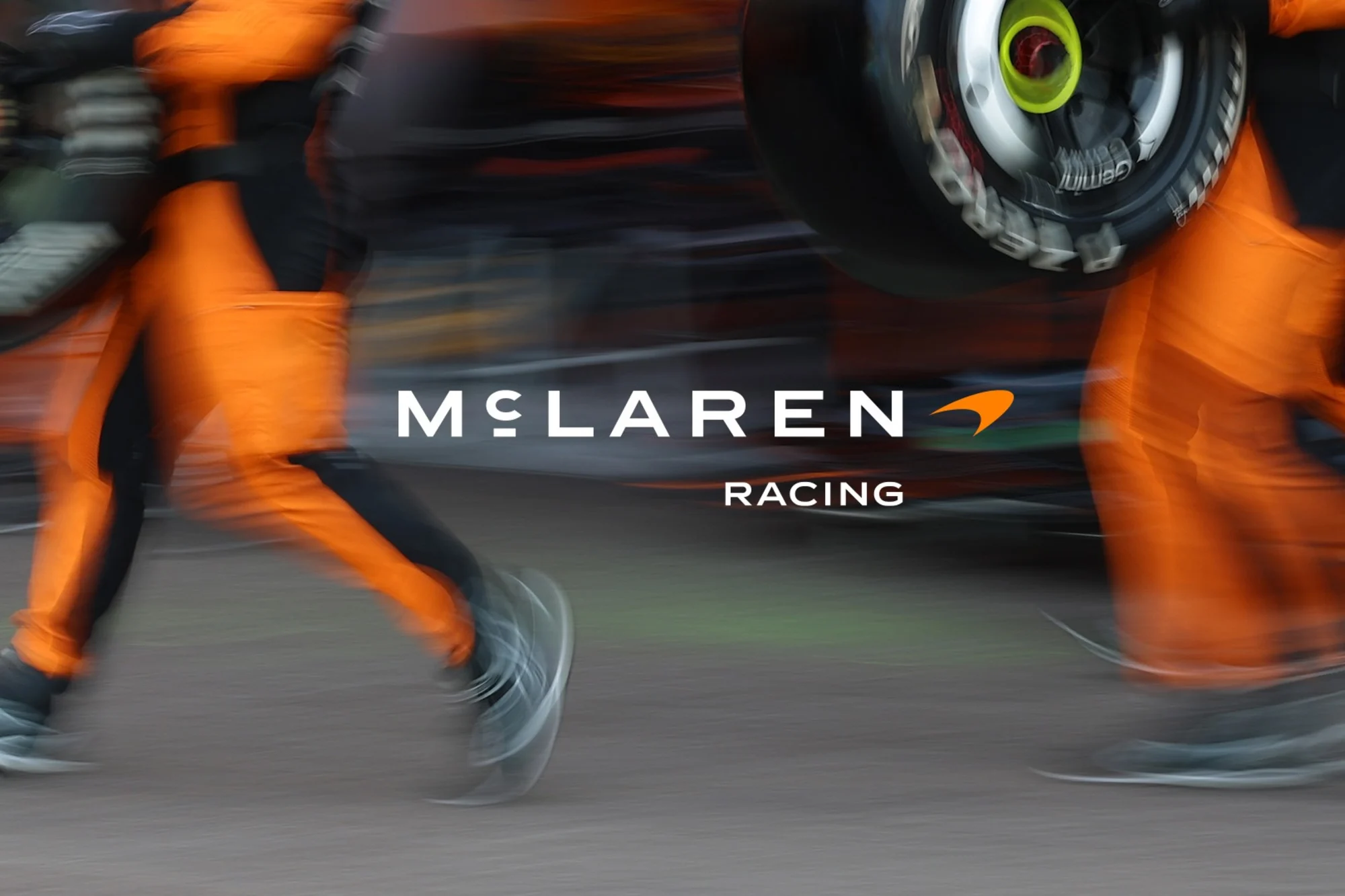
The timing is important. McLaren Racing is operating from a position of renewed strength, while McLaren Automotive has confirmed a major investment programme and ambitions beyond its established two-seat supercar territory. A unified brand system gives those separate areas a clearer shared language before the company enters its next phase.
McLaren Chief Marketing Officer Lou McEwen described the identity as a bridge between the company’s heritage and future ambition. That is the central idea: not retro design for nostalgia’s sake, but history used as a foundation for expansion.
The Verdict: Maybe Not Love at First Sight—and That’s Fine
Great rebrands rarely feel neutral. They interrupt familiarity, force comparison and invite people to decide what a brand should represent. McLaren’s new look does all three.
I may not love every decision yet, but I respect what the company has attempted. It has resisted the temptation to strip away its personality in favour of anonymous minimalism. Instead, it has brought Bruce McLaren, New Zealand, the Speedy Kiwi, papaya and six decades of competition into one system designed to support a much larger future.
Most importantly, people are talking about it. In a crowded luxury and performance market, attention is one of the hardest things to earn. McLaren has earned it immediately.
Whether the identity becomes as beloved as the mark it follows will take time. Logos live through victories, products, cultural moments and repetition—not presentation decks alone. But on its first day, McLaren’s evolved identity has already accomplished something valuable: it has made the world stop, look and debate what McLaren should be next.
Official source: Read McLaren’s complete evolved identity announcement. McLaren’s evolved identity connects its new wordmark with the historic Speedy Kiwi. Image courtesy of McLaren.